
I spent three days last week with color guru Maria Killam and a bunch of eager designers, decorators and stagers, refining my eye (which was, it turns out, pretty great already) to better see undertones. My goal was to make sure that I was doing the best job of choosing neutral colors, and to do that, you’ve got to understand undertones.
An undertone is basically the subtle color that is beneath, or can be seen through, a color. Although some people may still struggle to see it, when using a pure color undertones are pretty easy to see. Most of us can tell the difference between a pinky-orange and a yellow-orange.
-

- Pinky orange
-

- Yellow orange
It’s when we head over to the world of neutrals, where colors become very muted and toned down, that things get complicated, and often go awry. Many people cannot see the difference between a pink-beige and a yellow-beige. They think that neutral is neutral and that they all go together. Then, they can’t figure out why their rooms look muddy and mismatched and just ‘off’.
If you’ve ever tried to choose a neutral, or chosen the wrong one, you know what I mean!
What makes this more complicated is that we are in the beginning of a shift from a decade long earth-tone/brown trend to a major gray trend.
What makes this problematic is that so much of what people have in their homes (unless brand new) is what they might refer to as ‘warm beige’ or ‘taupe’ or ‘stone’. What they more likely have, is pink-beige.
While there is nothing wrong with pink-beige, it is difficult to work with as it does not play well with many other neutrals.
Then we have gray….the new trendy ‘base’ neutral.
Gray is a color that works best when it is fresh, alone, and highlighted with lovely brights.
Other neutrals are not lovely brights.

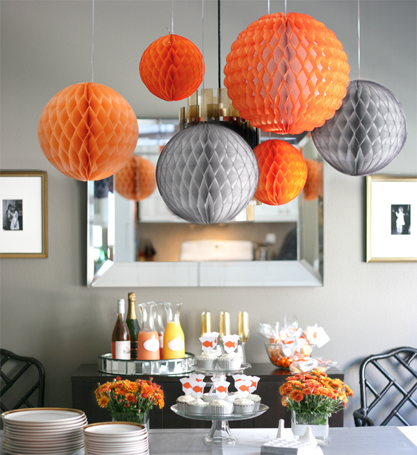
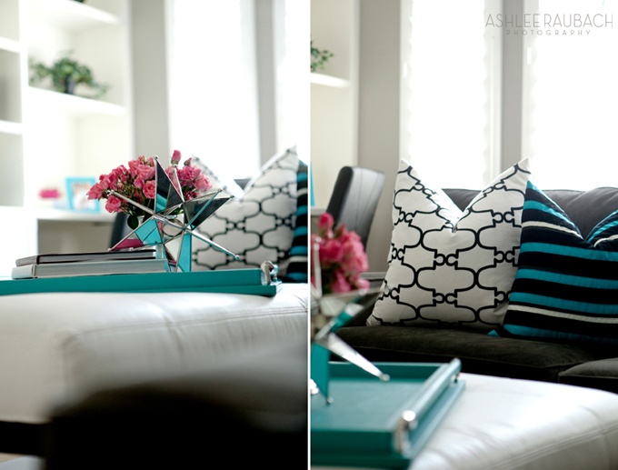
Can you see how yucky this room looks. They’ve tried, they really have – but the earthy wall paper with gray just looks bad. Can you imagine how pretty this would have been with white walls and bright turquoise accents? It would have been fresh and current and lovely.
Like this color story from photographer Ashlee Raubach..
Choosing the right color, especially the right neutral, can make all the difference in the world to how much you like your rooms, and thanks to my time spent with Maria, I can now call myself a …

…though, frankly, I’ve always thought of myself as one anyways ; )
Do you have a neutral room that just feels off?
Let’s Chat! Calgary Color Consultant Mia Calgary Color Consultant
I am redoing two blah bathrooms at a local town hall, they are stark white, windowless and just really need help…it’s an old fashioned building, but I’d like to add some pizzazz and yet not go overboard, what would you suggest?